The Consumer Reports engagement team is trending towards a 19.2% increase (!!!) in the conversion rate of our campaign pages. (In case it’s not clear: that’s a big deal.)
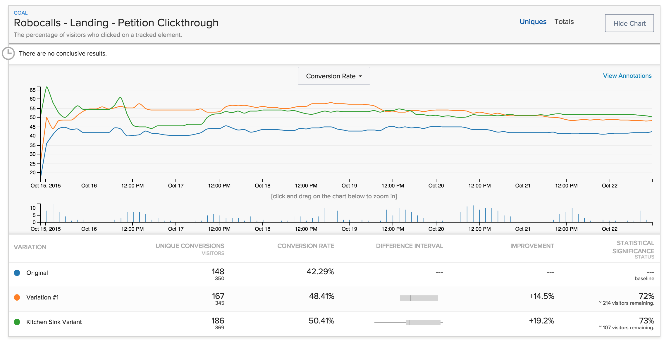
The test has yet to resolve, but it’s exciting none-the-less. We’ve been ramping up our AB testing capacity. We’ve had robust testing frameworks in place around our e-mail program for a while. But we hadn’t brought that rigour across to our campaign page design.
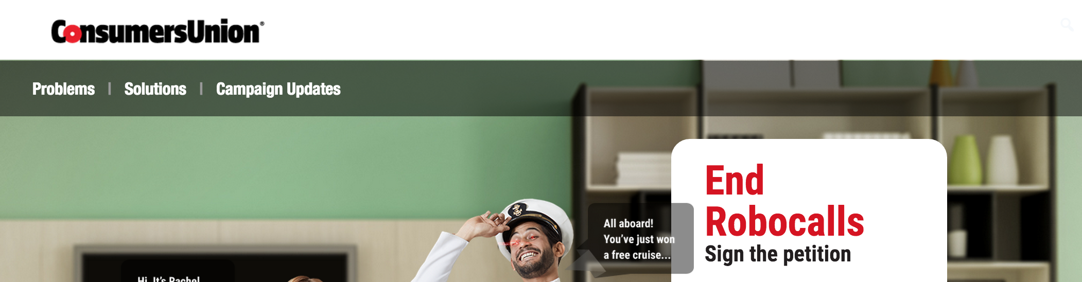
We set up the first web AB test on our End Robocalls site. We chose to optimize for signing the action: completing the white form on the top right. Our guess was the original page design presented too many options to the user. So we built two variants, each of which removed menu options from the top of the site.


As expected: reducing navigation options is resulting in higher conversion.
This was a safe thing to test. It’s fairly common knowledge that fewer exit points within a simplified user interface leads to higher conversion. The key thing, however, is that we now have the data to show the best practice also holds true for our community base. And it’s a great way to launch our testing program.
This is a finding we can take forward into the rest of our work. One that will have real impact. Building from this result will let us engage thousands more people in the actions we take to advance consumer rights.
Well done team!

Thanks for this Geoffrey. It took me a while to figure out what you swapped out, because there is still a navigation in there, what it looks like you took out was the “secondary navigation”, the “about us, contact us, and share” elements. Now that we have the nomenclature down it was a great test thanks for sharing!